


Big HomeScreen - Easy & Smooth
ICC Tech
When a phone is used by more than one person in a home, the first screen can become surprisingly important. It is where someone looks for a call, a message, a calendar entry, or the app they need before leaving the house. Big HomeScreen - Easy & Smooth takes that everyday starting point and makes it the center of its experience. I reviewed it as a personalization app from ICC Tech, and my impression is that its appeal comes from making the home screen feel more approachable rather than trying to turn it into a complicated command center.
The idea is especially easy to understand in a shared-device situation. A household tablet or spare phone may move between a parent, a child, and an older relative. Each person approaches the same icons differently, and a crowded default launcher can make simple tasks feel unnecessarily difficult. A larger, calmer layout can reduce that first moment of hesitation. The app is free, aimed at Everyone, and its current version is 1.1.2, so it is accessible to people who want to try a different home-screen style without committing money first.
That does not mean it is automatically the best launcher for every person. I found its value depends on what you want from the first screen. If your priority is maximum customization, dense information, or a carefully engineered productivity workflow, a more established alternative may suit you better. If your priority is clarity and a less intimidating starting point, this app makes a more convincing case.
How it feels in a shared household
Imagine a phone kept in the kitchen for practical use. One person checks the weather, another opens a shopping list, and someone else needs to make a quick call. In that situation, a large home-screen presentation is not merely decorative. It can make the device easier to hand over because the next user does not have to remember a tiny icon arrangement or search through several pages.
I would be comfortable recommending this approach for a shared device where people perform a small set of recurring tasks. The important distinction is that the launcher can organize access to the device, but it does not turn one phone into separate personal spaces. A household should not confuse a clearer home screen with account separation. Messages, photos, browsing history, and signed-in services still belong to the accounts and apps being used.
Related News

Why WhatsApp Messenger Still Makes Everyday Communication Feel Easy

Jurassic World: The Game Is the Better Dino Tycoon for Strategic Players

Threads in Real Life: Who Should Join, Lurk, or Leave

How SHEIN Turned Shopping Into an Endless Content Feed

How to Make Fortnite Feel Smarter on Mobile

Should You Switch to Microsoft Outlook on Mobile?
That boundary matters most when several people share one Android device. Before handing it around, I would check which accounts are active and whether sensitive apps are visible from the main screen. Big HomeScreen can make the visible layout easier to understand, but it should not be treated as a privacy layer. For a genuinely private arrangement, Android’s own user or guest features, where available on the device, are more appropriate than relying on a launcher alone.
The same principle applies to children. A large icon may make an app easier to find, but it does not establish age limits, purchase protection, screen-time rules, or communication boundaries. Those decisions need to be handled through the operating system and individual services. I like the app as a presentation layer for a supervised device, not as a substitute for supervision.
What the first setup should accomplish
My advice is to set it up with the least confusing arrangement rather than immediately trying to display everything. On a shared phone, the first screen should contain only the actions everyone understands: calling, messaging if appropriate, camera, maps, and the one or two household apps that are genuinely used. Moving less common tools away from the first view can prevent accidental taps and make the device feel intentional.
Gallery
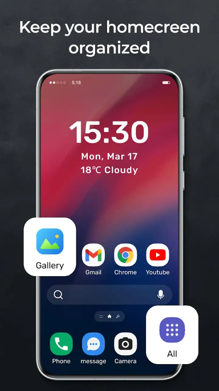
This is also where the app’s “big” approach creates a trade-off. Larger presentation improves recognition, but it reduces the amount of information that can sit in front of you at once. Someone who likes seeing many apps immediately may find the layout slower. I would rather accept that compromise on a family tablet or spare phone than on my main work device, where rapid switching matters more than visual simplicity.
A useful household workflow is to decide together what each visible item means. For example, one icon can represent the shared shopping list, another the family calendar, and another the video-call service. This turns the home screen into a small agreement about how the device is used. The benefit comes not just from size, but from reducing debate over where something is located.
I would also spend a few minutes testing the arrangement with the least confident user in the home. If that person can find the needed app without instructions, the setup is working. If they still ask where to begin, adding more icons will probably make things worse. The best result is often a deliberately limited first screen, with the full app list available when someone needs it.
Keeping personal boundaries clear
Shared devices need visible boundaries, and the launcher should be part of that conversation. A family member may recognize an icon but still not know whether opening it will reveal someone else’s account. Before using the app in a household, I would label the device’s purpose in plain language: shared tablet, guest phone, kitchen screen, or personal handset. That small decision helps prevent the large home screen from creating a false sense that everything on it is communal.
For a personal phone, the same design can still be useful. A person with limited vision, reduced dexterity, or simply a preference for uncluttered screens may appreciate easier targets and a more obvious starting point. In that case, there is no account-sharing concern, but the usability question remains: does the larger layout help you reach your most-used actions, or does it make the rest of the phone feel hidden?
I would not install it on a device that must serve as a high-density dashboard. People who constantly jump between work apps, authentication tools, notes, and communication channels may lose time if the visual design prioritizes spaciousness over compact access. Conventional launchers often win for power users because they expose more controls and support a wider range of home-screen habits.
Coordinating everyday tasks without overcomplicating them
The most convincing use case I found is coordination around simple routines. A household can keep the shared calendar, grocery list, transport app, and emergency contact route easy to reach. The launcher does not perform the coordination itself; it simply gives those tools a more prominent place. That distinction is important because it keeps expectations realistic while still showing where the app can help.
For example, a tablet near the entrance could open to a layout focused on weather, calendar, maps, and calls. A parent checking departure times would not need to navigate through a personal collection of games or work tools. An older relative visiting the home could understand the purpose of the screen more quickly. The arrangement works because the device has a defined role, not because the launcher magically knows who is holding it.
There is a practical maintenance issue here. Shared layouts become less useful when nobody reviews them. I would revisit the first screen whenever the household stops using an app or replaces a service. Removing an obsolete shortcut is more valuable than adding another option. This is one of the less obvious strengths of a launcher built around clarity: it encourages you to think about what deserves immediate attention.
Another good habit is to keep account-specific apps visually separate from shared tools. A banking app, private email account, or personal photo service should not sit beside the household shopping list simply because there is room. The launcher can make the distinction easier to see if the person setting it up uses a consistent arrangement, but the responsibility remains with the household.
For visitors, I would use the app only when the device is already prepared for guest use. A large, friendly home screen can make a device feel welcoming, yet a guest can still open anything that is exposed. If the phone contains private material, Android’s guest mode or a separate profile is the safer answer. This is a clear example of where a different system-level option is better than a launcher.
Age, trust, and the limits of a friendly layout
The Everyone age classification makes the app approachable for a broad audience, but I would interpret that as suitability of the app itself, not a guarantee that every app placed on the home screen is suitable for every household member. A child-facing arrangement still needs an adult to decide which applications are installed, which accounts are signed in, and what purchases or communications are possible.
For older users, the app may be worth considering because the main interaction becomes less dependent on remembering tiny symbols. However, large presentation is only one part of accessibility. I would pair it with the phone’s own text-size, display, sound, and accessibility settings, then test real tasks such as answering a call, returning to the home screen, and finding settings. If those actions remain confusing, the launcher alone has not solved the problem.
Trust also works in both directions. A family member may trust a shared device because it looks simple, while the owner assumes that simplicity means the device is safe to pass around. Those are different things. I would explain who can use the phone, what information is stored there, and which actions require permission. The clearer screen should support that agreement, not replace it.
One detail I appreciate about the app’s positioning is that it does not need to be framed as a complete household management system to be useful. Its role is narrower and more practical: reshape the starting point. That makes it easier to recommend honestly. Use it when the first screen is the problem. Look elsewhere when you need profiles, parental controls, automation, or deep device administration.
Where it stands beside ordinary launchers
The default launcher on an Android phone is usually the safest choice for people who want familiar behavior, broad settings, and tight integration with the device maker’s software. It may also be better for someone who dislikes relearning gestures or changing how the app drawer works. Installing a third-party launcher adds another layer, and even a smooth one can feel like unnecessary adjustment if the current setup already works.
Minimalist launchers take a different route by reducing visual stimulation, sometimes using text lists or extremely sparse screens. Big HomeScreen - Easy & Smooth sits closer to the idea of visibility than austerity. It is not asking the user to abandon apps; it is trying to make the starting surface more obvious. That makes it a better match for a shared household screen than for someone seeking a deliberately empty digital environment.
Highly customizable launchers remain stronger for users who want icon packs, elaborate widgets, gesture maps, folders, and precise spacing. They can create a more personal result, but they also demand more decisions. I would choose one of those when my goal was to build a tailored productivity dashboard. I would choose this app when my goal was to make a device understandable to several people with different habits.
The trade-off is therefore not simply appearance versus appearance. It is immediate recognition versus information density, and shared clarity versus personal control. That is the decision I would make before installing it. If the device has one expert owner, the default or a customizable launcher may be more efficient. If the device has several casual users, a simpler visual starting point can be worth the reduced density.
Practical questions before making it the household launcher
Will it work on an older phone? The stated minimum is Android 8.0, which covers devices that are no longer new but still in everyday service. That makes it a plausible option for a spare handset or household tablet, provided the device itself remains responsive. A launcher cannot compensate for weak hardware, a cluttered app collection, or an outdated battery.
Is it expensive to try? No. It is free, so the main cost is the time spent arranging the screen and deciding whether the new behavior feels natural. I would still avoid changing the launcher immediately before someone needs the device for an important appointment or trip. Give every regular user a chance to practice first, especially if they rely on familiar navigation.
Is it suitable for a private personal phone? It can be, particularly if you want a more visible, less crowded starting point. I would skip it if you enjoy fitting many widgets and shortcuts onto one screen or if you frequently customize every detail. The app’s strongest quality is its focused presentation, and that focus may feel restrictive to someone who treats the home screen as a personal workspace.
Can it replace separate accounts or household controls? No. I would keep Android profiles, guest access, account security, and parental settings in charge of those jobs. The launcher can make the chosen tools easier to find, but it does not create a boundary between users. This is the most important expectation to set before putting it on a shared device.
How established does it feel? ICC Tech’s app has an average rating of 4.5 from around 160 ratings, with over 10 thousand installs. Those figures suggest that people are finding value in the concept, while also indicating a smaller footprint than the most familiar launcher names. I would treat that as a reason to test it personally on a non-critical device rather than as a reason to dismiss it.
My household verdict
Big HomeScreen - Easy & Smooth is a focused personalization app with a sensible place in homes that share devices. I like it most when the phone or tablet has a clear communal purpose and the people using it do not want to hunt through a dense interface. Its large, approachable style can support coordination around everyday tools, especially when the household agrees on what belongs on the first screen.
My recommendation comes with a firm boundary: do not mistake a friendly layout for privacy, parental control, or separate accounts. Set those protections elsewhere, then use the launcher to make the approved experience easier to navigate. That combination is much more realistic than expecting one app to solve every shared-device problem.
For a personal power user, I would probably stay with the default launcher or select a more configurable alternative. For a family tablet, a spare phone, or an older user who benefits from a clearer starting point, I think this app is worth trying. It is free, supports Android 8.0 and later, and its current 1.1.2 release gives households a low-risk way to see whether a larger, simpler home screen improves daily handoffs.
My final view is straightforward: choose it for shared clarity, not for hidden controls. When the household keeps the layout purposeful and the account boundaries explicit, the app can make a common device feel less confusing. When the real need is privacy, automation, or deep customization, another solution will be the better fit.
FAQs for Big HomeScreen - Easy & Smooth
What is Big HomeScreen - Easy & Smooth designed for?
Big HomeScreen - Easy & Smooth is designed to make everyday phone use simpler, especially for seniors, people with visual difficulties, or anyone who prefers a less complicated interface. It replaces the standard home screen with larger icons, clearer text, and a more straightforward layout, helping users access calls, messages, contacts, and other essential functions with fewer steps.
Is Big HomeScreen - Easy & Smooth suitable for seniors or users with limited vision?
Yes. The app focuses on accessibility by presenting important controls in a larger, cleaner format that is easier to recognize and tap. The simplified design can be helpful for seniors and users who find crowded Android menus confusing. However, readability still depends on the phone’s screen size, display settings, and the user’s individual vision needs.
Can I customize the layout, icons, and shortcuts in Big HomeScreen - Easy & Smooth?
The app generally allows users to personalize the home screen so that frequently used functions are easier to reach. Depending on the version and device, customization may include arranging shortcuts, selecting useful applications, and adjusting certain visual preferences. Before downloading, check the current listing because available options can vary between updates, Android versions, and subscription or premium features.
Does Big HomeScreen - Easy & Smooth replace my phone’s original launcher?
It works as an alternative launcher, meaning it can become the main home screen shown when you press the Home button. Your installed applications and personal data remain on the phone, but the way you access them changes. You can usually return to the original launcher through Android settings, although the exact steps may differ by manufacturer and operating-system version.
Is Big HomeScreen - Easy & Smooth free to download and use?
The application may be available to download at no initial cost, but some functions can depend on advertising, in-app purchases, or a premium version. The exact pricing and included features may change over time, so users should review the Google Play listing before installing. Also check requested permissions and privacy information to understand how the app handles device access and user data.
Pros
- Simple layout makes essential shortcuts easy to find.
- Smooth navigation feels responsive on most supported devices.
- Large icons improve readability for users with poor eyesight.
- Minimal design reduces visual clutter on the home screen.
- Useful for seniors or anyone wanting a less complex interface.
Cons
- Customization options may feel limited for advanced users.
- Large elements can leave less room for app shortcuts.
- Some features may require permissions to work properly.
- The simple appearance may seem too basic for younger users.
- Compatibility and performance can vary across Android devices.


